The logo for the Rio 2016 olympic games is very nice, contrary to the aggressive one from London this year.
![]()
The typeface they have designed is also gorgeous :
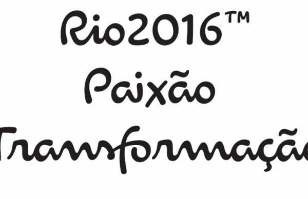
Each letter expresses a characteristic of the Rio 2016™ Games, its people and the city. The letters are written in single continuous strokes, with fast and fluid motions, suggesting the movements of the athletes in action.
The strong contrast between thick and thin strokes was explored during the design process by putting brush to paper and writing by hand. The variety of the curves in the different letters has a unique informality, inspired by the joyfulness of the Brazilian people